

If you look at the most successful product launches of 2026 from technical summaries to the latest dashboards on Vercel you’ll notice they all share a specific DNA. They aren't using traditional, sprawling long-form layouts. Instead, they are using Bento Grids.
Named after the Japanese lunch box, the Bento layout is the ultimate solution to the Information Overload problem. It is a way to take a complex set of features and package them into discrete, high-visibility compartments. For a beginner, it looks like a beautiful, organized puzzle. For a senior engineer, it represents the final victory of Modular CSS over the spaghetti layouts of the past.
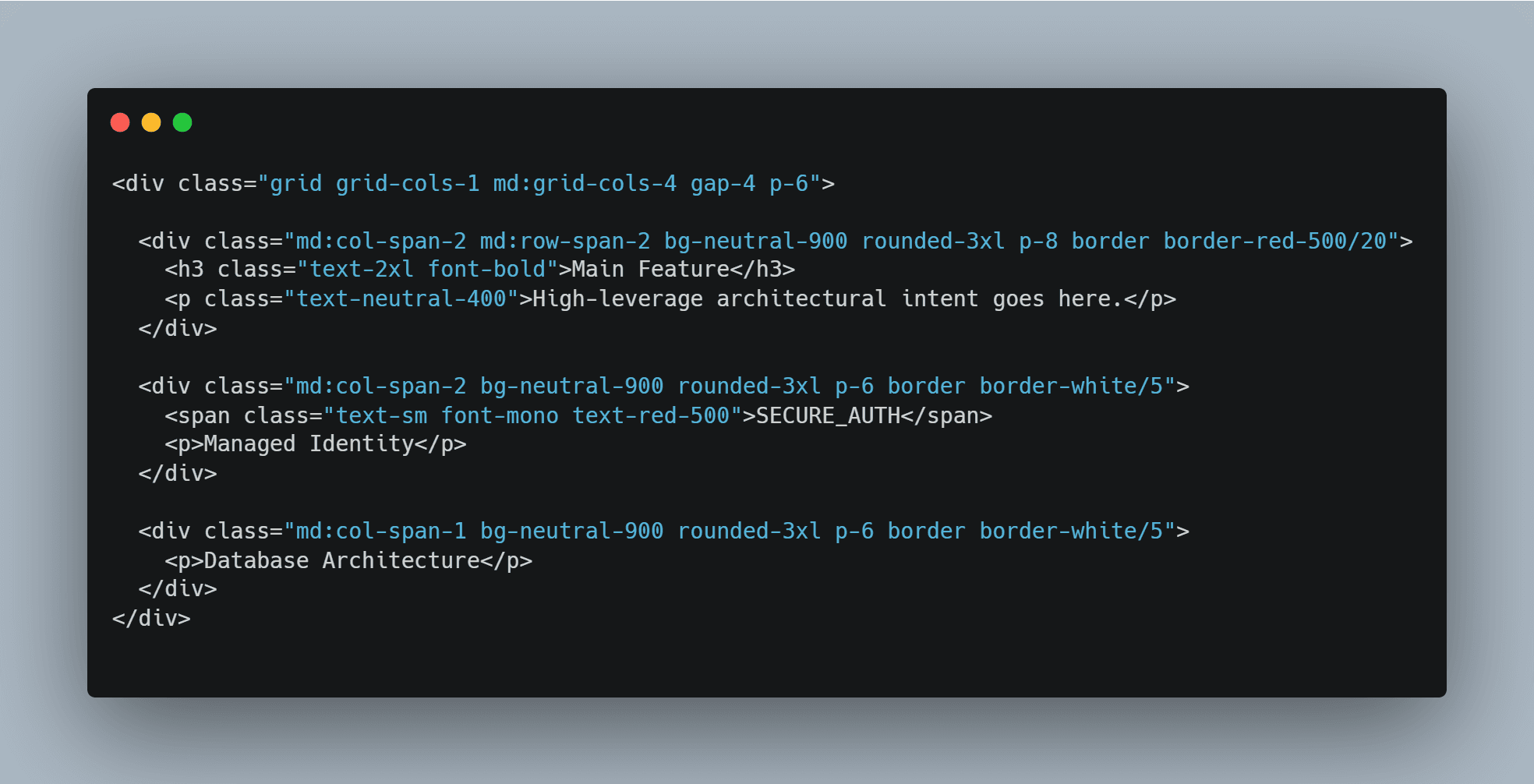
The Anatomy of a Bento Grid
A Bento layout isn't just a bunch of boxes. It’s a deliberate exercise in Responsive Hierarchy. The goal is to create a layout that feels stable and intentional on a 32-inch ultra-wide monitor, but gracefully collapses into a single, logical column on a mobile device.
The core principles of the 2026 Bento aesthetic are:
- Asymmetric Balance: Not every box is the same size. Your Hero feature might span two columns and two rows, while technical specs sit in smaller, peripheral widgets.
- Corner Radius Consistency: The modern look relies on a uniform, often aggressive border-radius (usually 24px or more) that makes every module feel like a self-contained physical object.
- High-Contrast Depth: Subtle shadows or border glows that make each compartment pop against a dark-mode background.
Implementation: The Tailwind + Radix Secret Sauce
Building a Bento Grid used to require complex math and absolute positioning. In 2026, we do it with CSS Grid and a few utility classes.
If you are using Tailwind CSS, the magic happens in the grid-cols and row-span classes. You define a 4-column base and then let your modules claim their territory.
But a grid is just a skeleton. To make it a Product, you need Radix UI. Radix provides the primitives—the accessible tooltips, popovers, and accordions—that live inside these boxes. By using Radix, you ensure that your beautiful Bento boxes aren't just pretty faces; they are fully accessible, keyboard-navigable components.
Why the Bento Layout is Overwhelming for the Old Guard
For developers who grew up on the 12-column Bootstrap grid, the Bento approach feels chaotic. It breaks the standard vertical flow. It demands that you think about Content First. In a Bento world, you cannot just throw code at the page. You have to decide which piece of information is the most important. If you give every box the same weight, the vibe is lost. You end up with a messy spreadsheet instead of a high-conversion interface.
The Bento Grid is the visual manifestation of Surgical Context. It forces the developer to be an editor, carving away the fluff until only the most important modules remain.
The Bottom Line
The Bento Grid is more than a trend; it is the Aesthetic of Modularity. It’s how we communicate that a product is complex on the inside but simple on the outside.
If you aren't building in Bento in 2026, you're still building for the 2010s. It’s time to stop thinking in pages and start thinking in compartments.


